2015 has been the year that we created our powerful plugin for WordPress: CaptainForm. We already told you what makes our product stand out from the crowd and how your company can benefit from it, but we are always thinking about new functionalities that will boost your experience as a user, and will facilitate the use of our forms. We may have already presented you with a lot of our superpowers, however the best is yet to come.
We understand how important your contact forms and websites are for you, that is why we want to make sure your business is thriving. Hence, this month you will observe an amazing improvement: a stunning redesign for your web forms. In other words, the user experience will improve due to a more advanced and modern look for your forms that follows the freshest design trends in comparison to the previous ones that were already obsolete. The general feeling of your online forms will be emphasized for you and your users, because of our new form design.
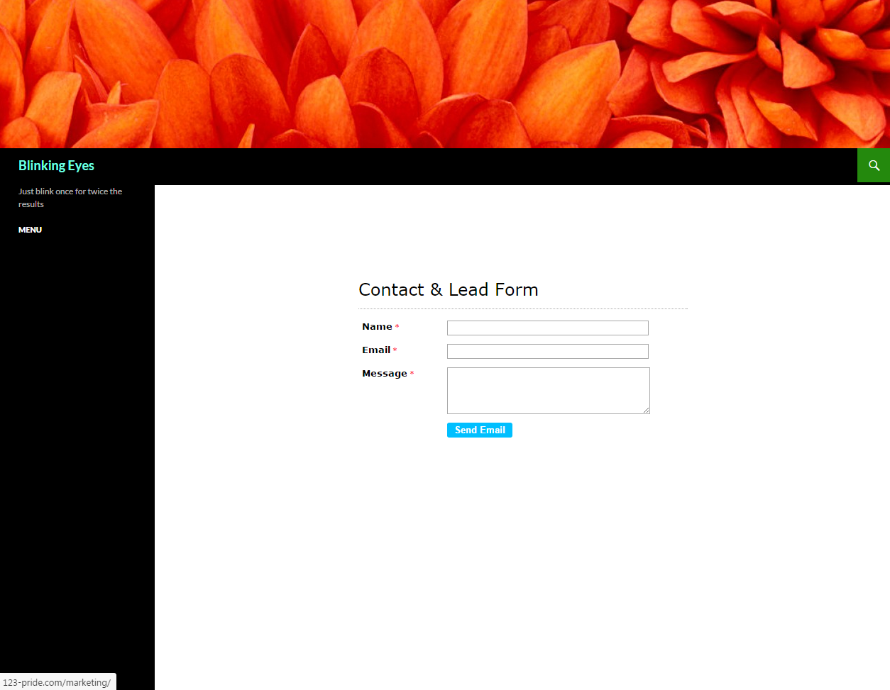
From now on instead of looking like this:

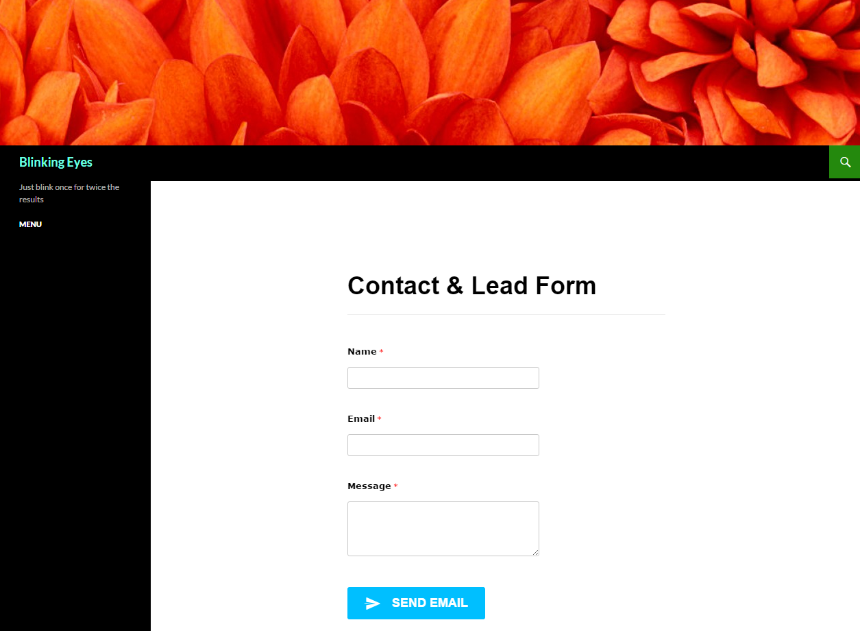
Your forms will begin to look like this:

Now, let us explain to you precisely how this transformation to a new web form design will happen, and what exactly will be modified:
- We are taking unneeded components out of the web forms – like the header bar which, after getting feedback from our users, was considered unnecessary. Moreover, you will have the power to use a header HTML block to tailor your form header the way you prefer. There won’t be any longer a standard design that will limit you.
- We are going to enhance the whole usability of your web forms. Here are some elements that you will obtain:
- the appearance of error messages was improved;
- the size of input fields was increased – making it easier to click and drag them on mobile and desktop;
- the size of the submit button was raised to facilitate the click on a mobile device;
- in general, a lot of form objects padding were increased to make them better spaced and easier to read.
- We are going to offer new fonts that are more consistent with webdesign trends used currently. The standard font is going to be Open Sans, which looks much more fashionable than the current Verdana.
- We will have updated graphical form fields in the new web form design, like star ratings, signature block, multiple fields upload, as well as updated standard form fields.
- You will also see an enhanced version of the look of the images that you put on your online forms. Because now they will be full-width instead of floating, which will make them more visible.
- Furthermore, the web forms will also be full-width.
- And last, but not least, one of our most exciting improvements: our web forms are now more mobile friendly. This means that they will respond and appear better on mobile devices than our old versions, because they were built using Bootstrap.
We made all of this with you in mind. You shared with us your needs and we provided you the solutions. We hope you love and appreciate your new web form design as much as we do. It’s time to say goodbye to the old design of your forms and let’s welcome our new Forms 2.0 design! More and more superpowers for you, that is CaptainForm.
Share with us your thoughts about all the improvements. What do you think about them?
Admin
Latest posts by Admin (see all)
- CaptainForm deprecation - April 7, 2023
- Survey: How Has The New Reality Impacted You? - June 29, 2020
- The WordCamp Europe Berlin Memories - July 10, 2019
Leave A Comment?