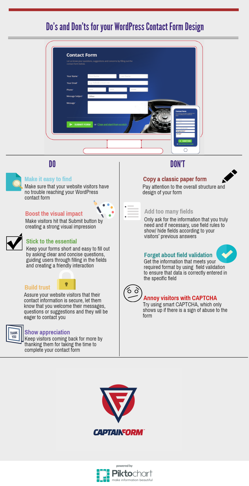
There are various aspects to consider when creating a professional WordPress website for your business and one of them is the trusty contact form- it’s actually the most important section on your website. Even so, you can still find many business-killing contact forms online.
Admittedly, there is no absolute “right way” to create and design a WordPress contact form, but there are several best practices you can employ and some things you can avoid. Our infographic below provides some simple Do’s and Don’ts for a well-designed WordPress contact form. Follow them and you’ll grow your business faster than a speeding bullet.
Enjoy and feel free to share!
Did we miss something? Let us know in the comments section below and stay tuned for more tips.
Admin
Latest posts by Admin (see all)
- CaptainForm deprecation - April 7, 2023
- Survey: How Has The New Reality Impacted You? - June 29, 2020
- The WordCamp Europe Berlin Memories - July 10, 2019

Leave A Comment?