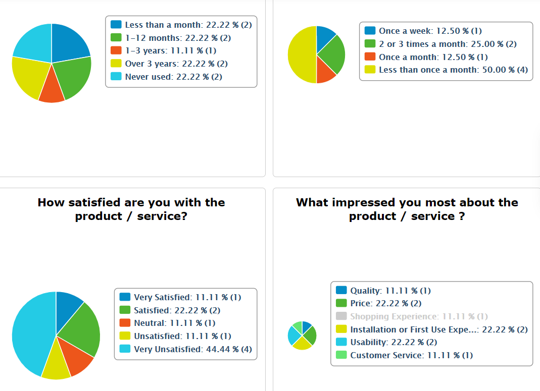
Reports are rendered through charts. Each field is shown in a separate chart. Options have different associated colors and are measured percentually and by the number of submissions. When you first access the Reports section for a form, you see the default report, that contains all form fields, shown in pie charts, in the order that they appear in your form.

